on gratitude, family & sabbaticals
Read Moreon gratitude, family & sabbaticals
Read Moreand bamboo. and fungus. and why we should take a note.
Read Moreand a lesson while losing my breath
Read Morethoughts on diversity
Read Moretake a minute.
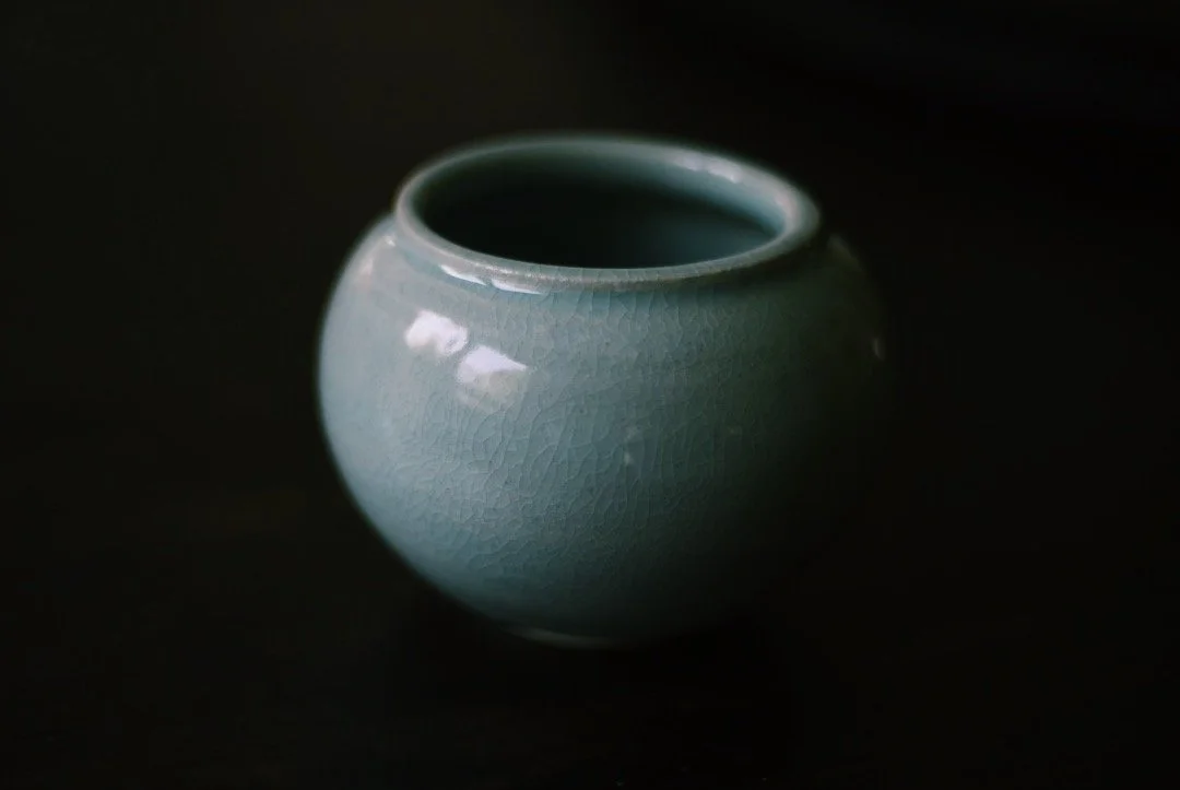
Read Moreor, beauty’s where you find it
Read Morequestions to begin asking for the coming year
Read Morea somewhat uncharacteristic rant
Read Moreyour passions create civilizations
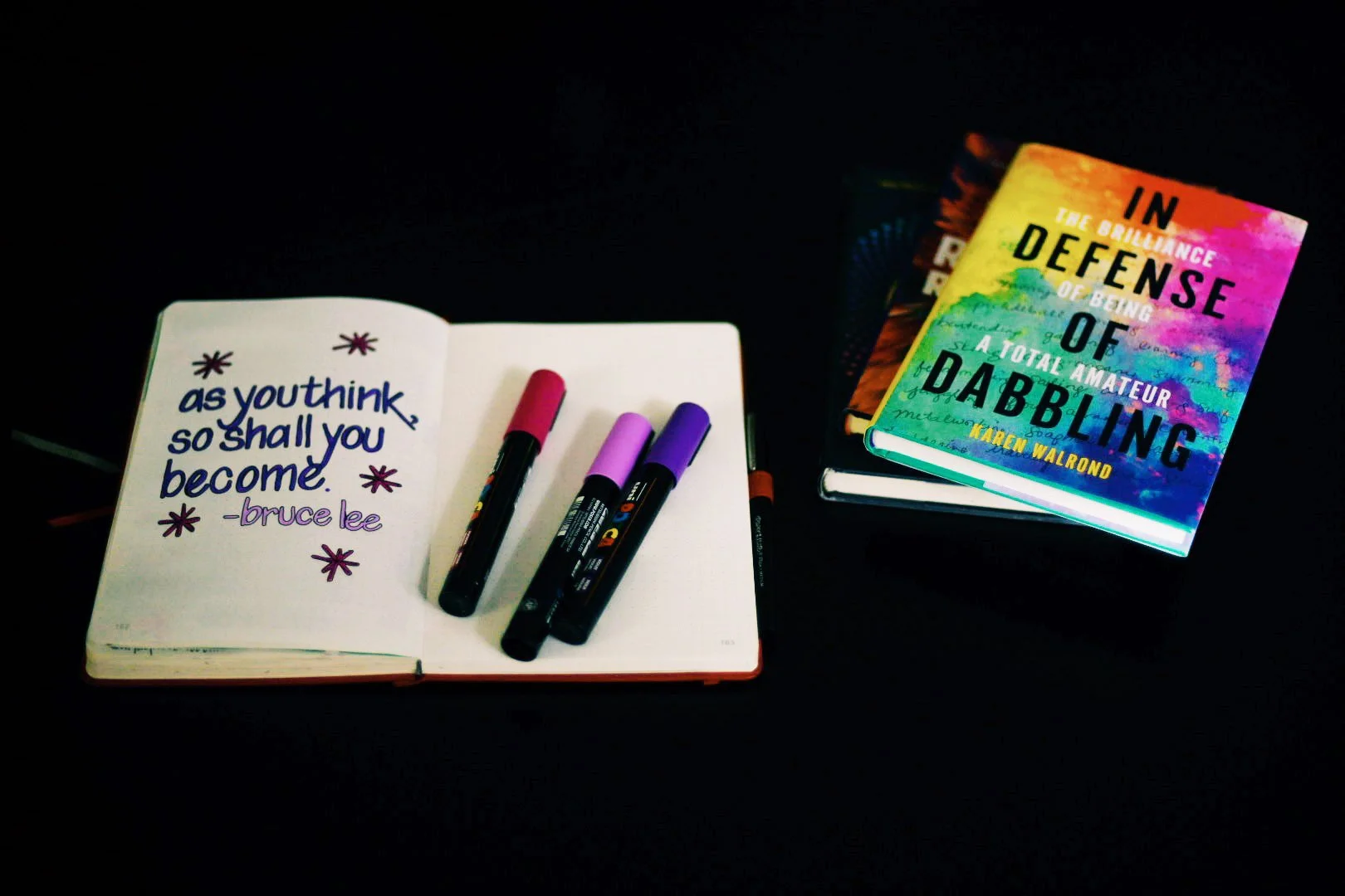
Read Moreit begins!
Read Morethe celebration of In Defense of Dabbling begins!
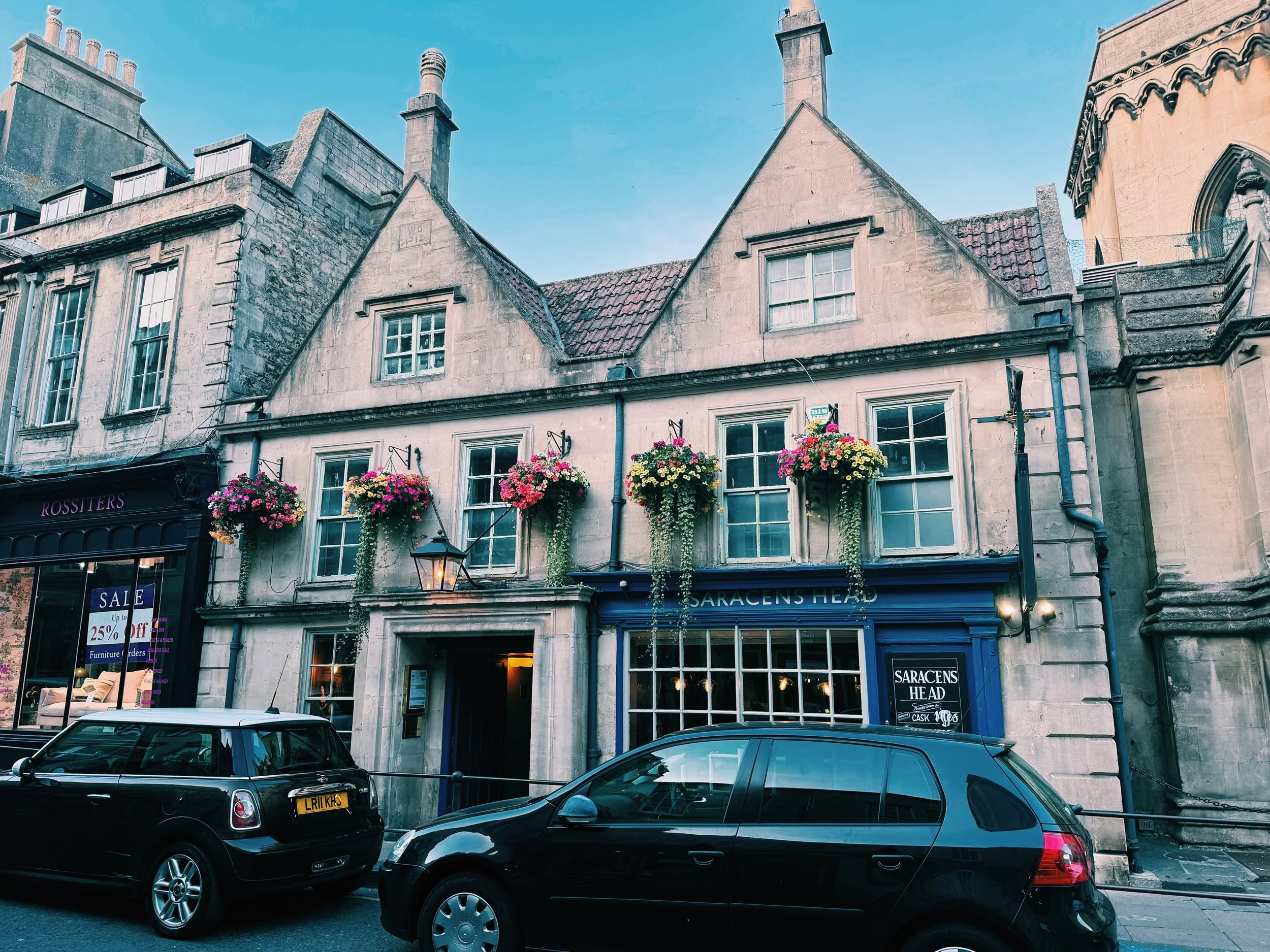
Read Moremarcus’s home county of cornwall
Read Moreplace influencing person.
Read Morea lesson from a man “down the pub.”
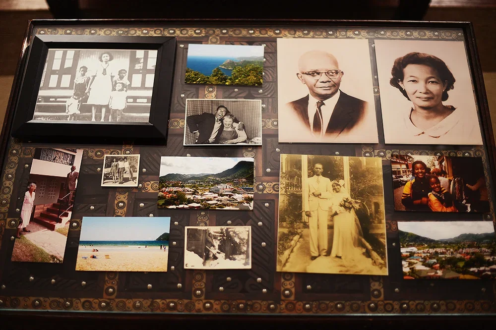
Read MoreIn the words of my grandfather
Read Moreand how to create your own
Read More