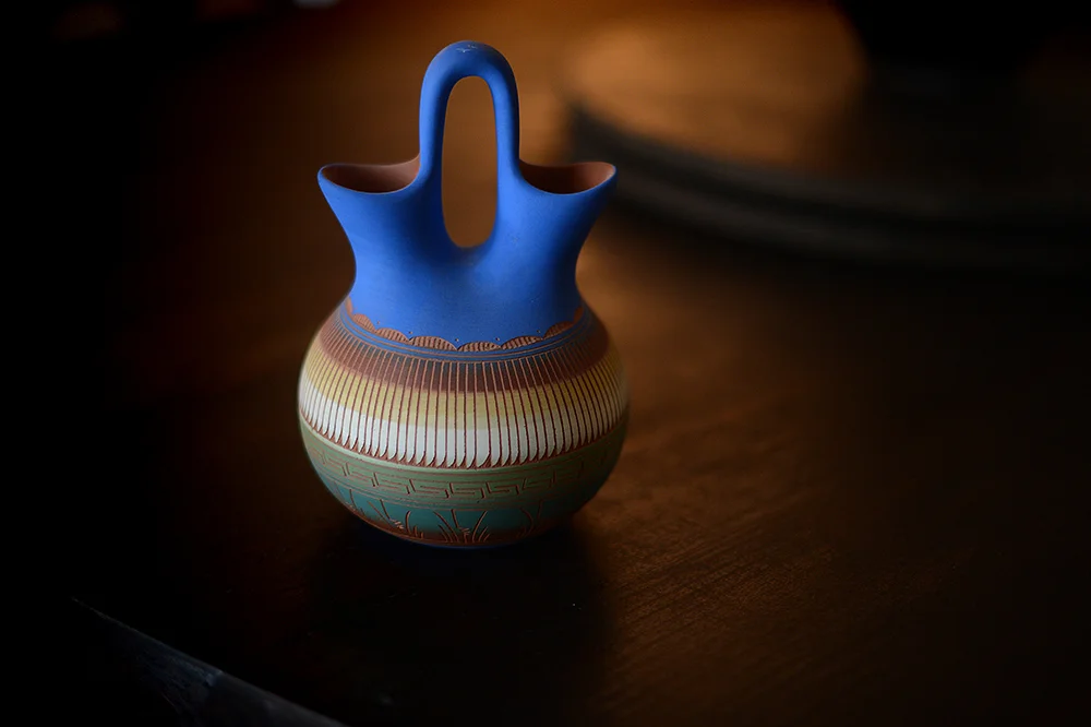
texture, colour & light
For the last couple of years, I've noticed a trend in photography -- a sort of clean, minimalist, bright-white style. Like this. Or this. Or even this. I love it. I love the stark light, the clean lines, the simplicity of it.
And I can't do it for the life of me.
Every time I put a camera in my hands, and try to capture a clean, minimalist shot it just doesn't feel right. I automatically turned toward something with obvious texture, bright colour or moody light. It's the same with my house, actually: I look at bright houses in muted tones and clean lines and I covet them, and yet my own house is filled with furniture and tchotchkes with bright colours, or carved wood, or tarnished patinas -- and some of these things were purchased brand-new that way too. I can't help it: maybe it's because I think texture and colour and light (particularly moody light) hint at a story. A history. Some sort of mystery.
And I'm a sucker for mysterious historical story.
Anyway, my point is that try as I might, I can't shoot what doesn't feel right. For 2016, it's a lesson that I'm taking to other, non-photographic aspects of my life as well.
Hope you guys had a wonderful end-of-year. Here's to a year where we do what feels right.
Did you miss my big announcement on New Year's Day? Learn more about the new coaching sessions here; and be sure to check out the brand new Light & Colour A/V Journaling course: it's all about adding colour and light into your winter days. Registration is open now, course starts February 1st!
Soundtrack: First train home by Imogen Heap